Modernizing India's Enterprise Backbone
Redesigning HR, Employee Self Service, and Mobile Payroll for 30,000 corporate clients.
Project context
Webtel Electrosoft handles mission critical payroll and compliance for over 30,000 corporate clients. Operating at this massive scale on 10 to 20 year old architecture created immense friction for everyone involved.
End users were forced to juggle two separate mobile apps just to check their attendance and download a payslip. Meanwhile, HR administrators were trapped inside a 450 screen maze on the desktop suite. Whenever users got lost, they flooded the Webtel support desks with calls.
As the sole product designer, my mandate was to completely rebuild the structural logic across these three platforms and deliver production ready frontend code to the engineering team.
The Ecosystem
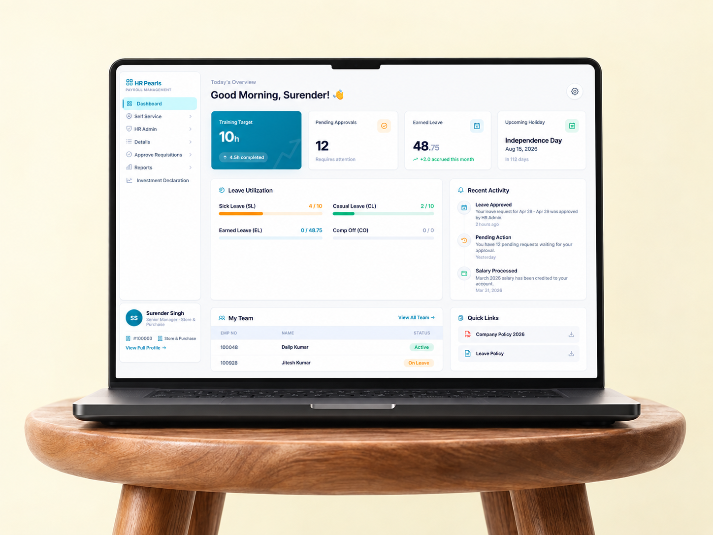
The Modern ESS Portal
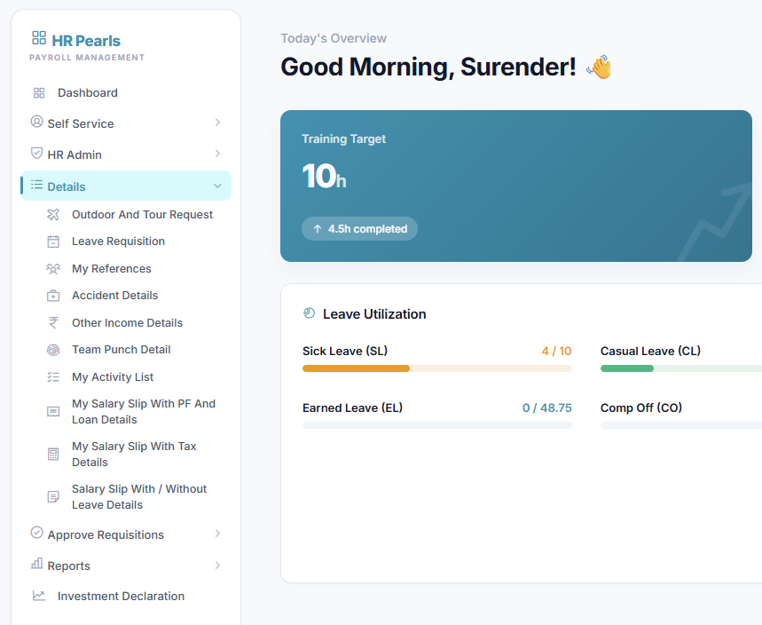
The legacy portal was bloated with over 120 screens. Through rigorous information architecture mapping, I unified the experience and collapsed it down to just 70 core pages.
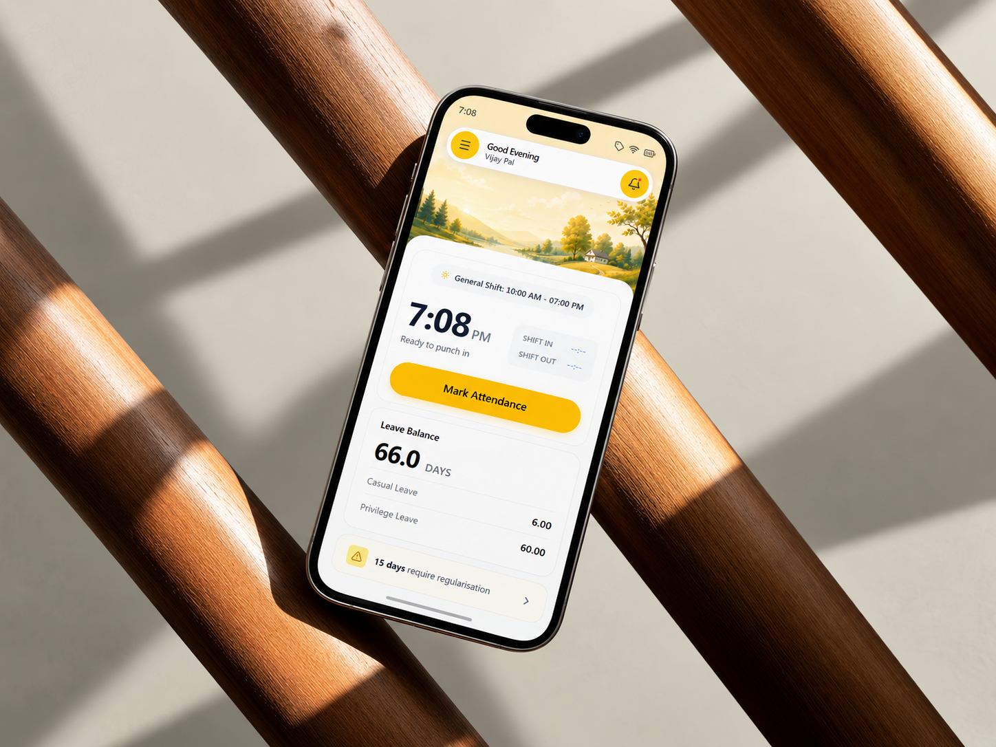
The Unified Mobile Application
By gracefully merging overlapping features, I consolidated both platforms into a single ecosystem. This cleared up enough interface space to introduce brand new administrative features directly into the mobile workflow.
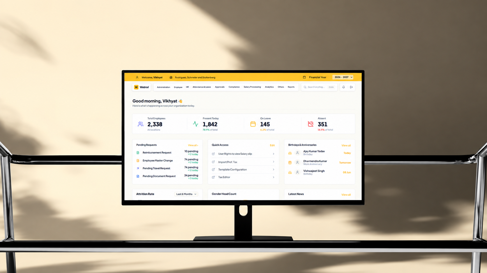
The 450 Screen HR Admin Centre
To solve navigation across 450 screens, I designed a Grand Search command palette. Even with fuzzy terms, the system instantly suggests deeply nested configuration pages.
Key design moments
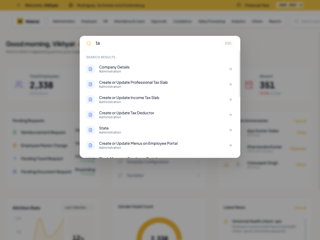
Insight 1: Designing for fuzzy intent
A standard search bar fails when users do not know the exact database terms. To bypass a 450 screen nested architecture, the system needs to understand human error and operational stress. By linking the Grand Search command palette to a massive keyword database, I designed for fuzzy intent. When an administrator types a vague or misspelled term, the fuzzy matching logic maps it to the correct technical label and drops them directly into the target configuration page.
Insight 2: The anatomy of progressive disclosure
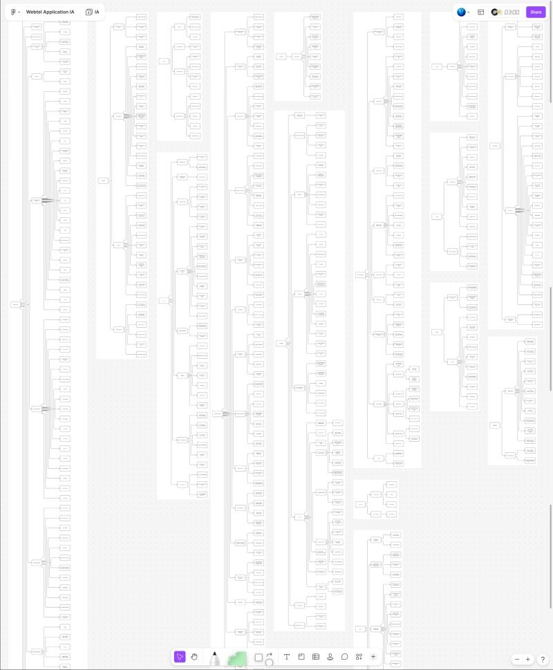
Enterprise interfaces often overwhelm users with too much upfront data. To shrink the core administrative workflow from 24 screens down to 16, I rebuilt the interface strictly around progressive disclosure. The UI anticipates user needs based on their role and hides heavy configuration data behind secondary interactions. This chunk based modular architecture allows system administrators to toggle massive feature blocks on or off globally without needing developers to write custom code.
Insight 3: Quantifying cognitive load
Bad navigation in enterprise software creates friction that leads directly to expensive support calls. To validate the new Information Architecture, I evaluated the structural logic using Hick's Law, which calculates the mathematical effort required to make a decision based on available choices. By stripping away redundant options, the system's overall cognitive load dropped drastically.
Insight 4: Bridging the design to engineering gap
Delivering pixel perfect screens is only half the job. The real bottleneck in product design is translating those screens into live responsive components. Using AI native workflows, I generated boilerplate code to manually craft the CSS styling and core interface logic. Handing over a plug and play frontend framework allowed the engineering team to deploy the new architecture instantly rather than rebuilding structural UI elements from scratch.
Impact
Architecture Collapse
Unified the legacy footprint from 120 screens down to 70 core pages, streamlining the overall ecosystem.
7x WCAG Compliance
Overhauled legacy contrast ratios and introduced robust keyboard navigation to meet modern accessibility standards.
1.2x Market Capture
Empowered the sales team with an all-in-one mobile workflow pitch, directly driving new client acquisitions.
32.9% Cognitive Optimization
Lowered the cognitive load from 3.46 bits to 2.32 bits using Hick's Law calculations across the HR Admin Centre.
60% Support Deflection
Integrated an AI Help Bot projected to dramatically reduce the volume of manual Help Desk support calls.
Rapid Deployment
Delivering a production-ready frontend framework instead of static mockups eliminated the need to rebuild core UI components from scratch, significantly accelerating deployment.
Instant Customization
The modular architecture eliminated hardcoded permissions. System administrators can now instantly deploy tailored portals for any of the 30,000 corporate clients without touching backend code.
Reflections
Tackling an enterprise giant like Webtel proves that heavy structural logic is just as important as visual aesthetics. Bypassing a 450 screen navigation problem with a fuzzy logic keyword search completely shifted my perspective on how to design for massive scale. Delivering actual responsive frontend frameworks instead of static mockups demonstrated how bridging the gap between design and engineering fundamentally accelerates product velocity.